Playing with Line
Hello and happy Spring!! Welcome back to another creative experiment, this time we’re talking about LINE. In the world of picture-makers, line is a powerful tool that has incredible range. No two people will draw a line in the same way. How someone draws a line, what they draw it with, and when they choose to use it —and leave it out— are all integral to an artist’s unique style.
As a kid, I drew almost exclusively with line. My parents, both architects, had loads of ballpoint pens hanging around the house. Black ballpoint pen and printer paper became my go-to tools. Sometimes I colored things in, but that feeling of laying down ink on the smooth paper was the highlight for me.
A drawing I did as a kid, maybe 5 years old
This is one of my favorites. I love that this princess is skipping along and singing, oblivious to the dog/cat eating a bird behind her.
Over the years I’ve become more self-conscious of my own work, as happens when you do something for a living and have to be critical of it. I’ve been swayed by trends in illustration that favor bold shapes and bright colors, with line taking a back seat. I’ve questioned whether I like the way my work looks when I use line. It’s a journey I am still on, but I’ve slowly come to the realization that it isn’t line that I dislike, it’s the tightness with which I use line. I’ve been making line-based drawings for 30+ years, and in that time I’ve gotten a little too good at it. I can bend a line to my bidding without even thinking about it — which means it’s easier to overwork it than to let it flow.
This is especially true when I work digitally, as I often do lately. The infinite undo means I can be even more precious and nit-picky about my line work. Not good! So I’ve been counter-acting this by trying multiple layers of line work, each layer I let myself be a little more free and fast. It’s helping a bit, and I wanted to see what might happen if I pushed this further. I decided to roughly trace my digital lines with traditional pens, then scan those drawings and layer them back in over my digital color layers.
EXPERIMENTING
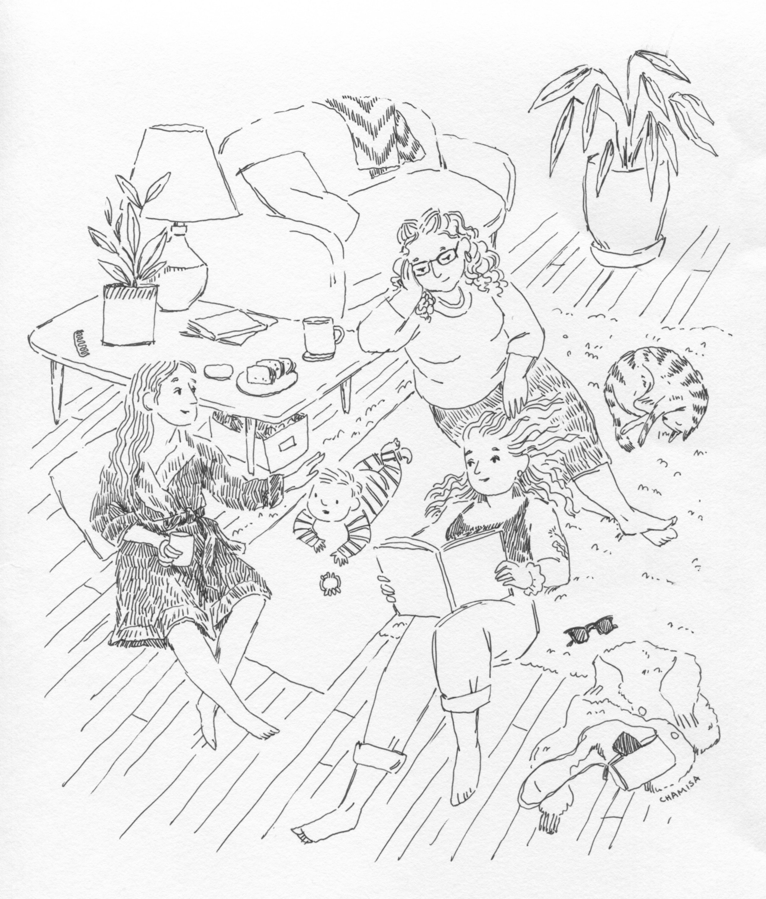
Here is the illustration we’re playing with today! I’m very happy with the composition and subject matter, a sweet little ode to friendship and my friend’s growing family. I drew this in procreate on my ipad, using my usual choice of a digital pencil for the line work.
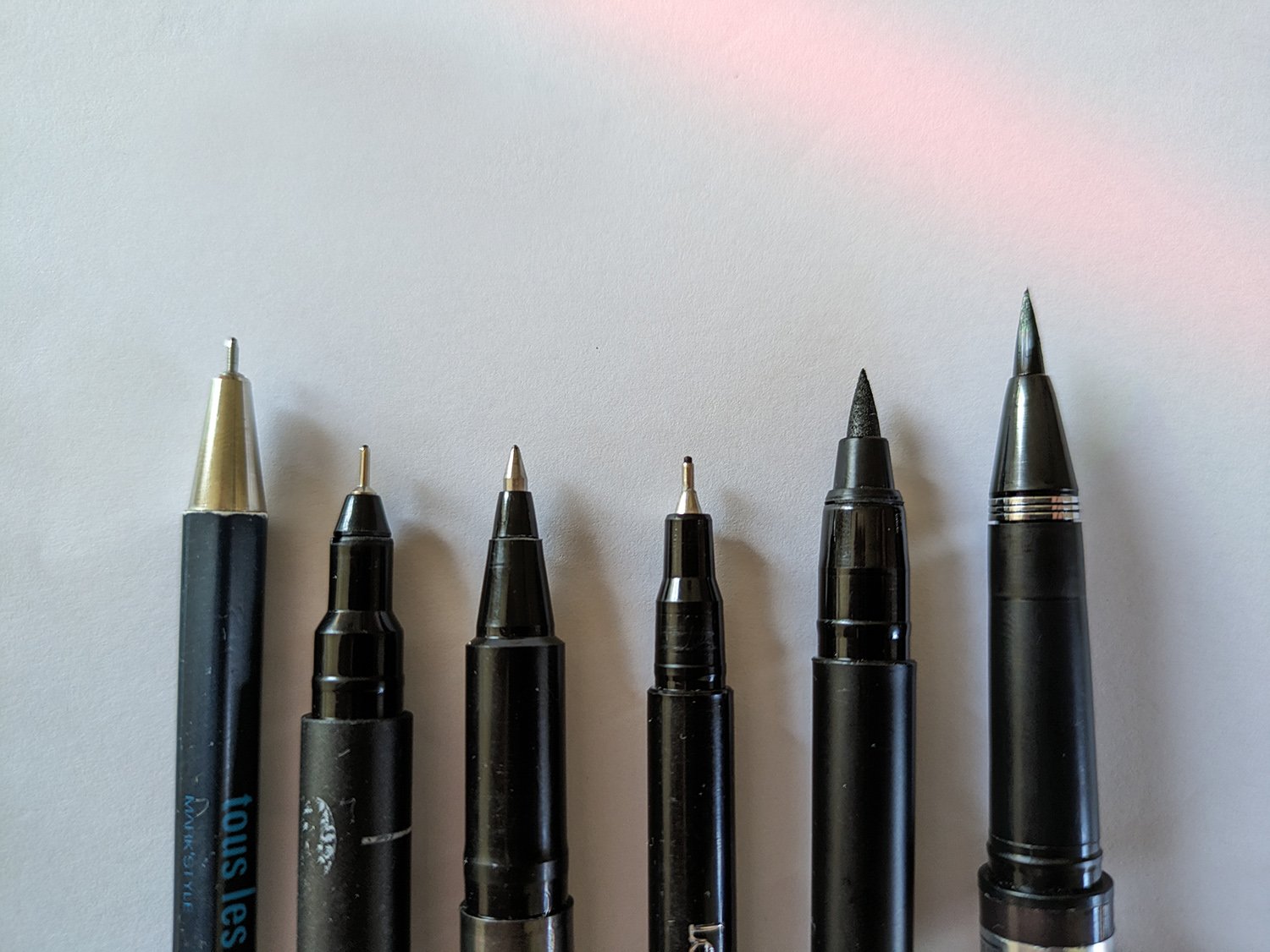
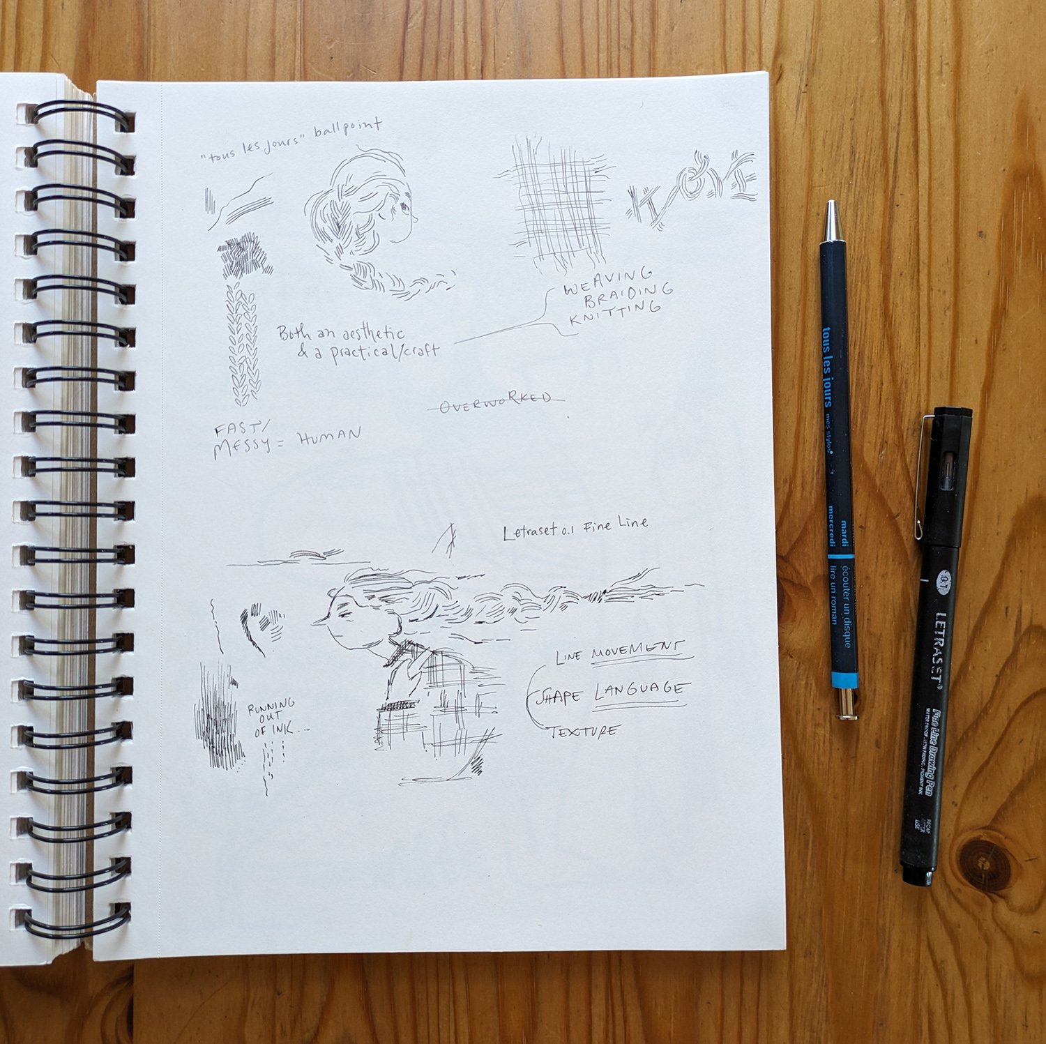
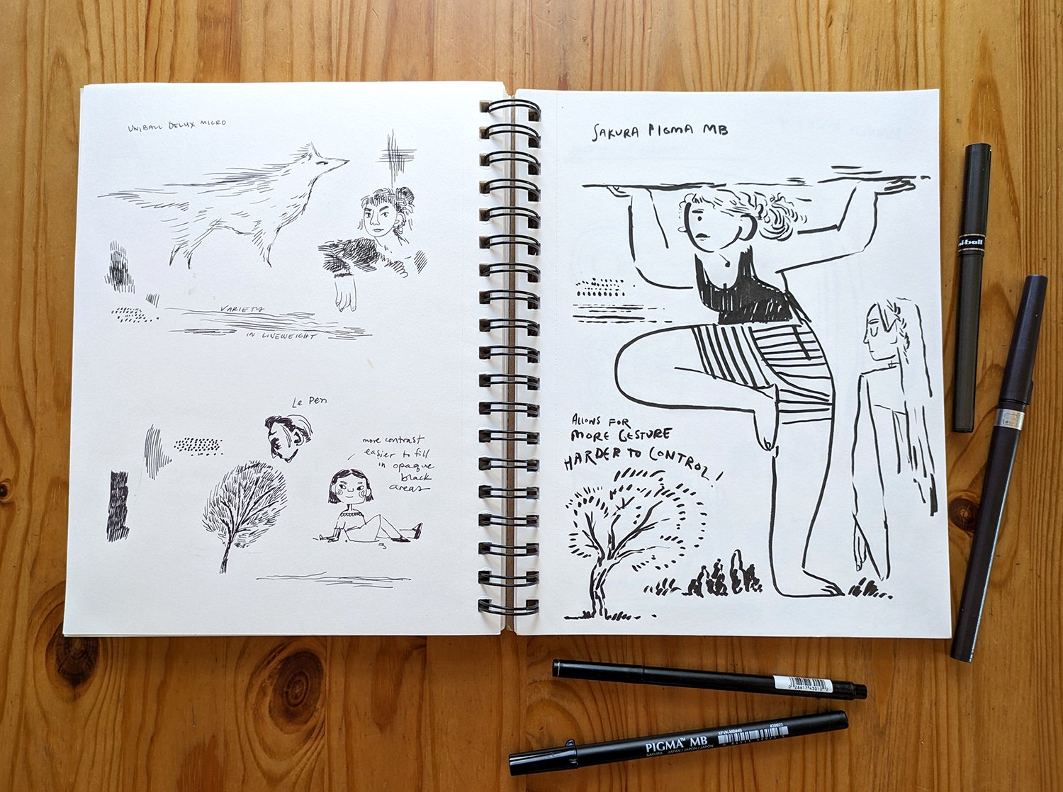
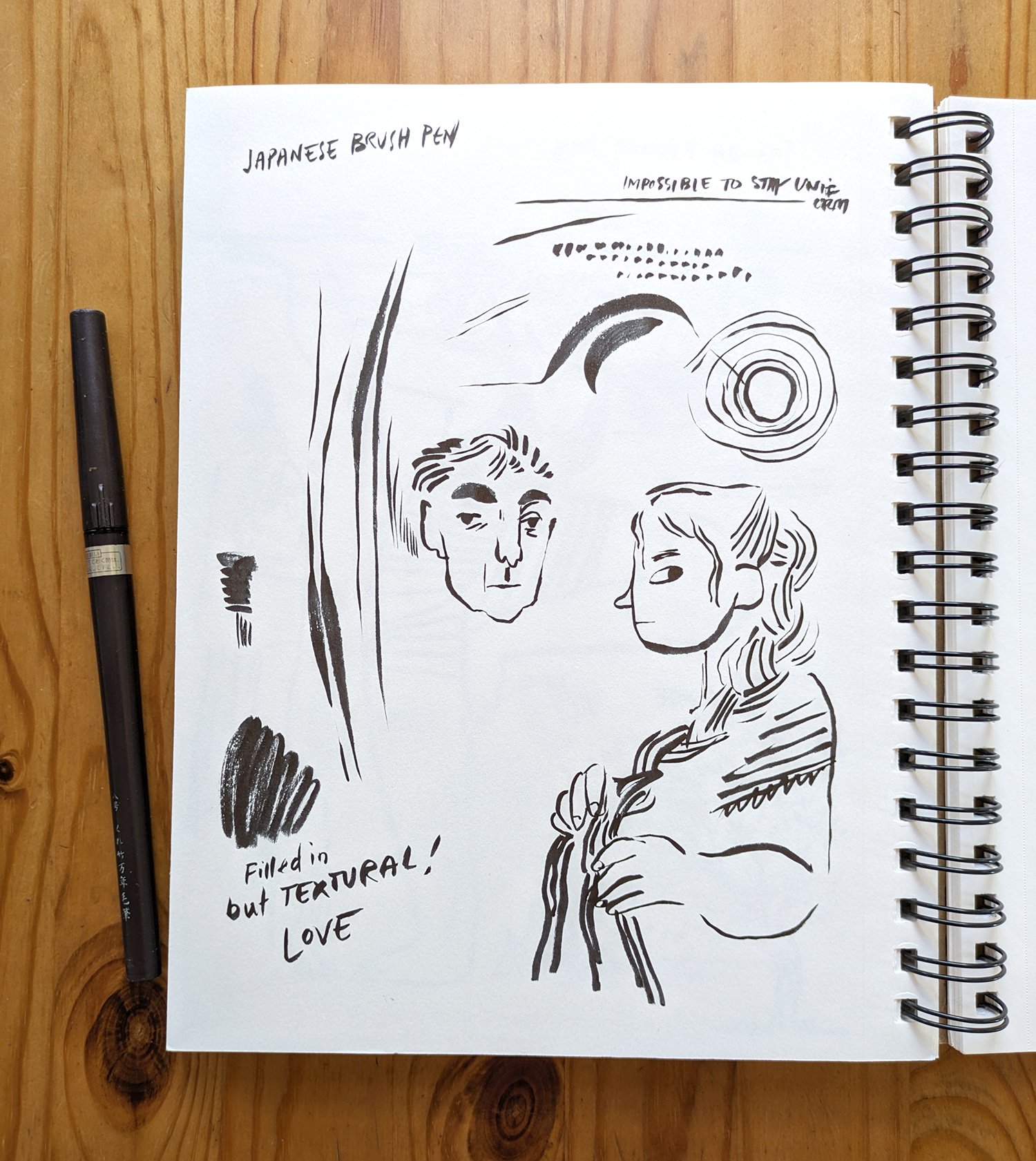
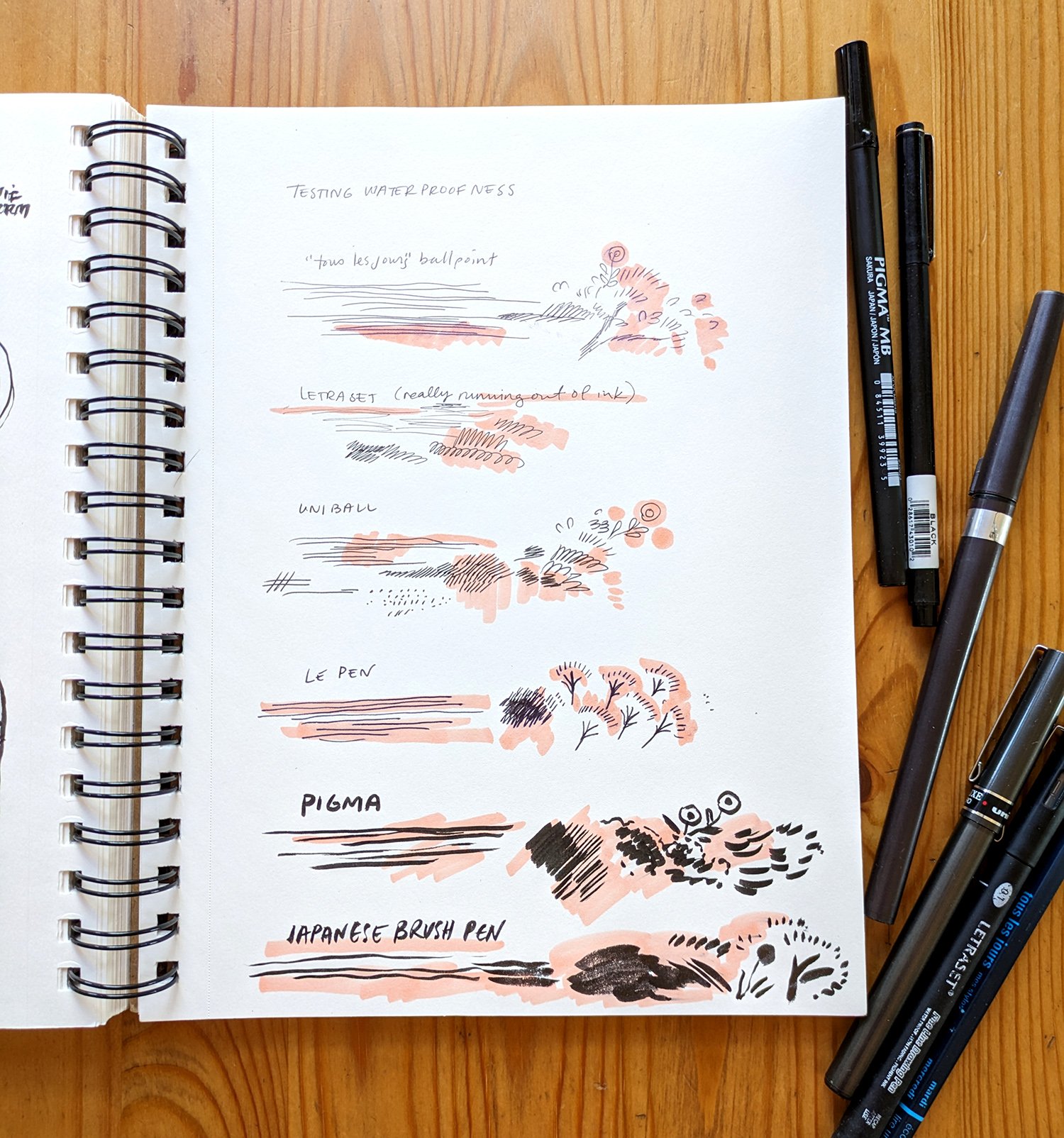
I like it! I like the softness of that pencil line, but it’s feeling a bit stiff. So! Time to experiment. I pulled out some of my favorite pens and did some testing in my sketchbook. Here’s a little gallery of that process:
I ultimately decided on a uniball ballpoint (the favored pen of my childhood), and a lusciously inky Japanese brush pen.
Using an app on my ipad called Trace Table which conveniently turns my ipad into a lightbox, I roughly traced the lines from my illustration onto paper, once with the ballpoint and once with the brush pen.
Brush pen on paper
Ballpoint pen on paper
The Big Reveal
Now it was time to scan those and layer them into my file, replacing my digital line work. Here’s the final reveal! First the brush pen:
And the ballpoint!
It’s no surprise that I’m leaning towards the ballpoint. I’m really happy with the looseness of that line and the way it’s not perfectly aligned with the color. But that brush pen is pretty luxurious, and i love the moments of pure black. What do you think??
Inspirations
It was tough to narrow down artists for this section, but I decided to choose a few illustrators across the last 100 years or so. Each of them have an incredible mastery of line and use it extensively throughout their artwork.
Bill Watterson, Calvin and Hobbes
This will not be the last time I reference Bill Watterson in this blog. His comic Calvin and Hobbes, is one of my original influences as an illustrator. Watterson’s control of line is mind-blowing, not to mention the fact that he can consistently draw the same characters over and over again. He is also a killer watercolorist.
Bill Watterson, Calvin and Hobbes
Bill Watterson, Calvin and Hobbes
Bill Watterson, Calvin and Hobbes
Yuko Shimizu
Yuko Shimizu has got to be one of the best illustrators currently working. She was a legend when I was in art school and she remains legendary. Her work is strongly defined by line, created with traditional ink and brush and then colored digitally. She’s also a professor at the School of Visual Arts and is worth a follow on instagram. The images below give a small taste of her incredible range in subject matter, character and composition.
Yuko Shimizu, Hell-O-Kitty
Yuko Shimizu, The Cat Who Saved Books cover
Yuko Shimizu, Fully Booked Daily Planner cover
Kay Neilsen
A pillar in the Golden Age of Illustration in the early 20th century, Danish illustrator Kay (pronounced "Kigh") Neilsen’s work is both a product of its time and completely outside its time. His subject matter was often myth and fairytale, referencing clothing and architectural styles that long predated him. Perhaps this is why his work feels so timeless today. He uses line in such an expressive way, both as gesture and as texture. If you’d like to know more about Kay Neilsen, I particularly enjoyed this article about his life on Terri Windling’s blog.
Kay Neilsen
Key Neilsen
Kay Neilsen, from East of the Sun and West of the Moon
DIVE DEEPER WITH PATREON
Join us on Patreon for an even more in-depth video of this whole process! Paying members get access to monthly process videos and other behind-the-scenes posts, as well as art goodies mailed throughout the year. You can also join as a free member and follow along with fun freebie posts a couple times a month.
That’s it for this month’s experiment! I’m so glad I pushed to see what lay beyond my usual boundaries and comfort zone. I will definitely be bringing what I learned through this process into my future work.


